
No products in the cart.
Blog, Farmhouse Decor, Wall Decor
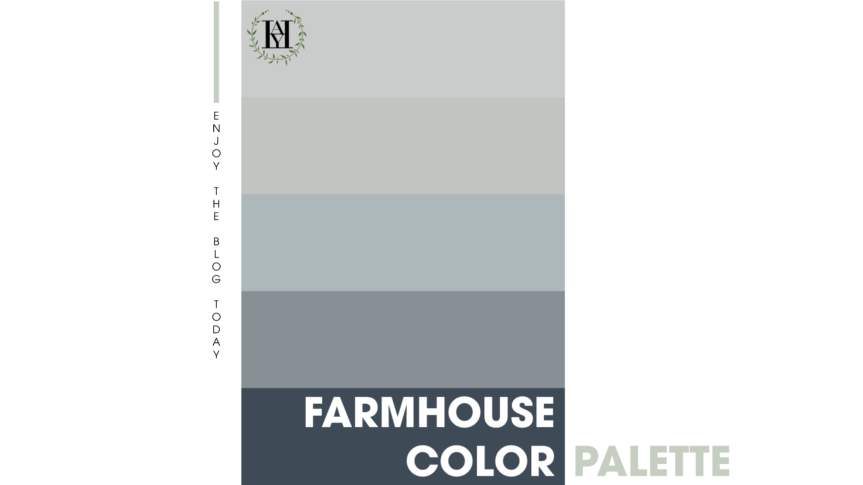
TIPS To Choose The Perfect Farmhouse Color Palette – My Top Picks
Choosing the appropriate farmhouse color is the key to obtaining a beautiful farmhouse-style home. But having trouble choosing paint colors for your living space? Here are some suggestions on a stunning farmhouse color palette and tips on selecting a perfect color scheme. Let’s find the answer in the article below.
Contents
1. What is farmhouse style?
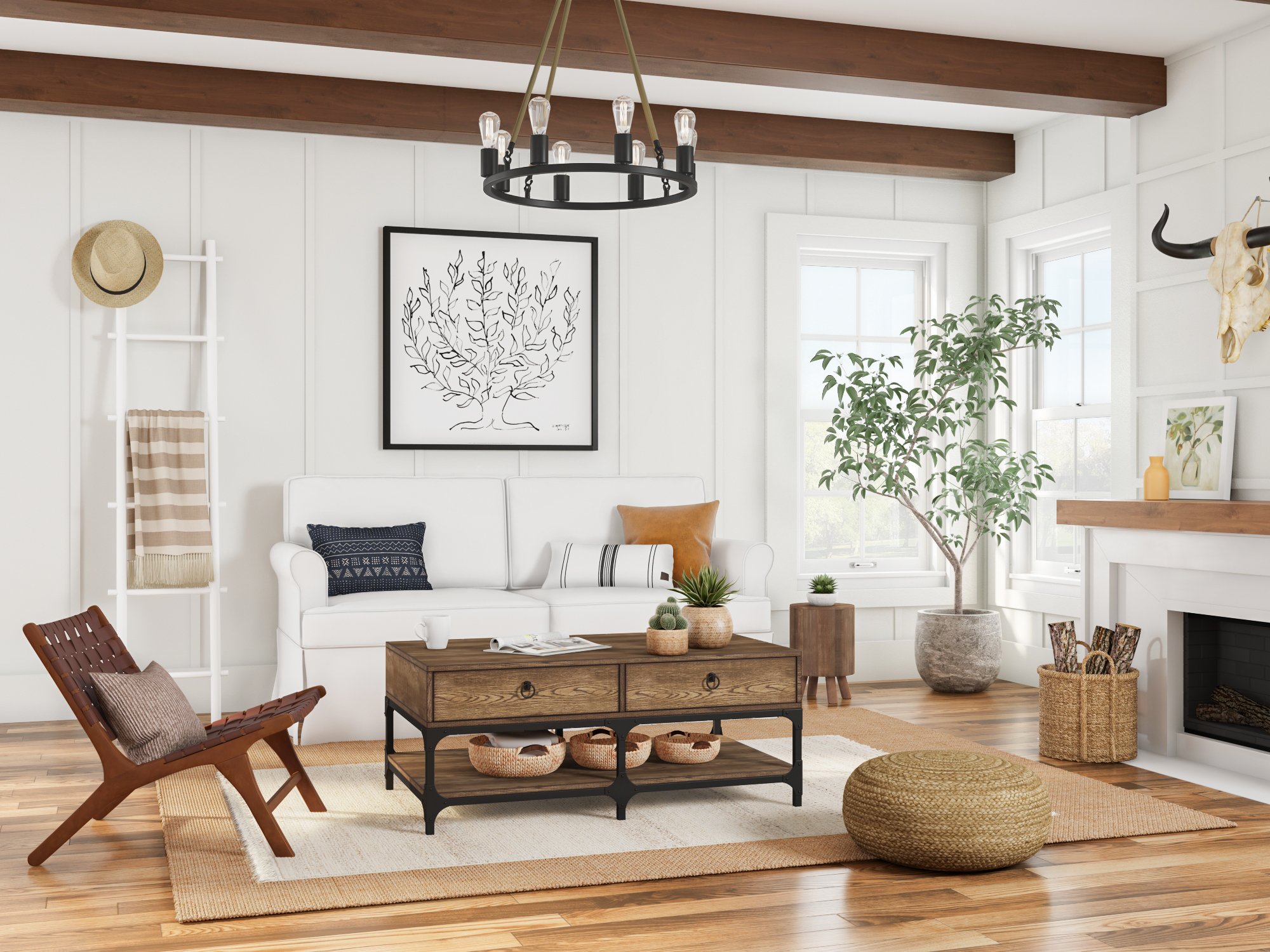
Farm decor is inspired by ranch-style homes, which can be found in rural or farming areas. Materials used in the farmhouse style often come from local suppliers, so they are mostly rustic and often have a nostalgic look. This makes farmhouse style seem warm and comfy and not stuffy or formal, extremely accessible and comfortable. That’s why it is adaptable and welcoming for most types of families.
Read more: 8 Reasons Why Farmhouse Style Is So Popular And Its Well-Known Types
2. Farmhouse color palette
The best way to get the farmhouse’s vibe you desire is to decide on the farmhouse color palette you’d want to establish in your area. Selecting the right farmhouse color will be a lot simpler with the specific color information below.
2.1. White
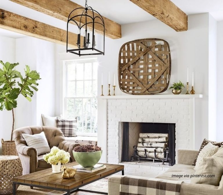
White represents the desire for simplicity, while also reflecting refinement. So it’s no wonder that white is quite popular not only in casual style, but even in farmhouse decor. White is also an option to bold the rustic style to emphasize its classic style.
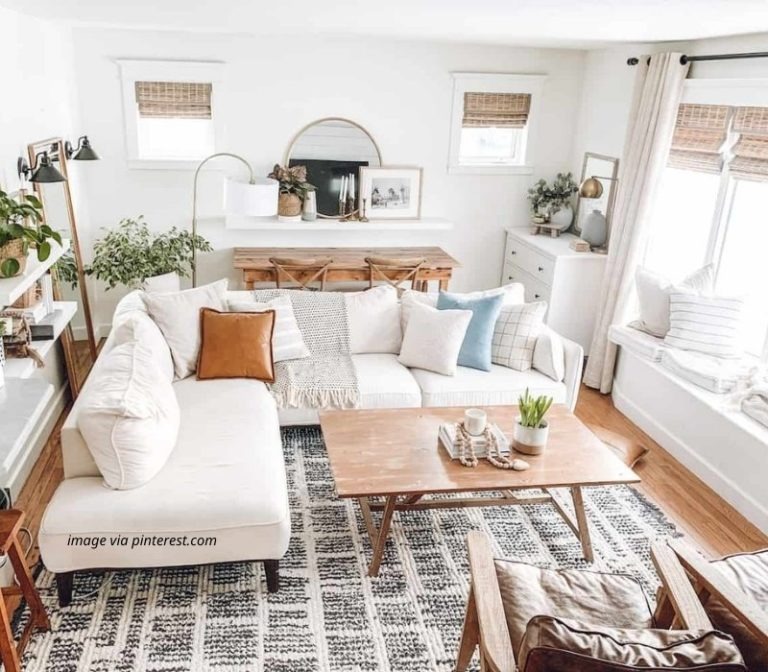
In particular, with the white background, you will easily decorate the whole room. A simple example of how the color may be used is to highlight rustic and vintage furniture and accessories in the space. Furthermore, painting the walls white can assist to make the area seem brighter. Because white amplifies light, it may utilize its inherent capability to enlarge the area and make surfaces seem bigger by reflecting light naturally.

If you choose this color, it will help you set the tone for the rest of the space, creating a soothing and inviting environment.
2.2. Beige
Well, what if you dislike white because it’s overplayed and boring, but at the same time, you want to preserve the farmhouse color palette? Beige is just what you need.

The beige color used on the walls does a great job of creating softness, warmth, and harmony in the home. Beige tones give a space a calm and relaxed sensation as they get lighter and airy with each shade. Beige is a neutral and delicate farmhouse color scheme, so it may be used to highlight and complement other colors in your farmhouse decor. Examples of accenting the space may include draperies, wooden tables, wall tiles, flooring, and so on. Use these samples to inspire your ideal farmhouse’s style.

2.3. Gray
Gray is a neutral color known as a combination of white and black, so it is extraordinary in itself. Gray brings in the mystery of black, but also conveys the simple look of white.

Just because the farmhouse style feels warm and comfortable doesn’t mean the gray color palette can’t be used. You can choose gray as a background to accentuate textures, including incorporating neutrals like white and beige or classic wood furniture, stone. It definitely gives you a different look at the farmhouse style with gray. Some shades of gray will look bold, but to keep it warm yet cool, choose cool gray or owl gray.

Another alternative is some shades of gray with a combination of beige, where there is still a good option.
2.4. Blue/green color
If you like something different but still showing nature, you should definitely consider a blue or green color for a farmhouse scheme in your home.

These colors will give your room a fresh feel and soothe fatigue. Using a blue or green color palette gives a feeling of freshness, coolness, and creative inspiration like the blue itself. One thing to keep in mind, however, is that because the paintings of blue and green are highlighted from other basic farmhouse paint colors. It’s a good idea to use light tones to make the house look airier. Like the dawn of a new day, making people want to immerse themselves in a space full of energy.

However, it should not be more than three tones to avoid causing clutter to your home.
3. Tips for choosing the perfect farmhouse color palette
3.1. Get a sample first
This is probably the most essential step when narrowing down your paint colors. There are thousands of templates available online for you to choose from, but there will be a slight difference between the image and color sections, so you should try painting a small part on the wall in the room first.

By looking at how the color applies in different lighting conditions and with different types of furnishings, you’ll get a sense of how it will look in your space at various times of the day and with your existing décor. It’s much easier to paint those sample coats of paint than to paint the whole room and then have to repaint it because you don’t like it. The sample is also a really great option for this. You can buy patterns that you just need to peel and stick to the wall and remove when you’re done.
3.2. Farmhouse color scheme paint combines with the interior color
The house is painted in a color scheme but not considering the color of the interior, the balance ratio in the architectural color scheme makes space not achieve the desired sophistication. Sometimes it also causes boredom and cold for the whole room. For example, the wall color of the house is a neutral gray color but the interior space of the house is also gray, which will make the room less prominent.
The color scheme for the house is not only an artful work but also a scientific calculation factor of the ratio of colors, location, type of house. When deciding on an interior or exterior paint color, it is very essential to use paint colors, combine them based on specific principles, and make decisions accordingly. Here is a good set of principles to find out the ideal color scheme:60 – 30 – 10 rule:
The principle of the 60 – 30 – 10 ratio color scheme means that in the house color scheme, only up to 3 different colors are used to coordinate to help bring harmonious colors, easy-to-see visuals and also ensure the element’s variety of living spaces. This house color scheme can be applied to the house paint color scheme with this ratio.

The house paint color scheme follows the rule of dividing color groups into basic groups:
Primary colors: Red, yellow, blue and if 2 colors of this group 1 are mixed, they will form group 2.
Secondary colors: Orange, green, and violet are secondary colors. If the paint colors of group 1 and group 2 are mixed, they will form group three colors.
Tertiary colors: Intermediate colors orange-red, yellow-orange, yellow-green, blue-violet are intermediate colors.

The dominant color (level 1) occupies 60% of the painted wall area of the house. The secondary color (level 2) accounts for 30% of the painted wall area of the house, often used in locations with structural changes. And the last accent color (level 3): 10% of the house’s painted wall area for points and arrays that need to be decorated with accents, decorative moldings.

3.3. Coordinating house paint must match the light
In a space with solid light, the color painted on will be much lighter. And vice versa when space is smaller, the light is weaker, the color will look bolder. Therefore, before choosing and coordinating a beautiful house paint color for your space, you will need to calculate whether the light is weak or strong and the area of space to choose light and dark paint colors to adjust the feeling of the house space better.

For example, if you are painting a large room with lots of natural light, you can choose a darker paint color if you want. If it’s a smaller or darker room, choose a lighter color.
3.4. Check out Pinterest
Last but not least, don’t forget to check out Pinterest to find inspiration. Many bloggers are sharing their experiences with colors and their thoughts, which can give you some really good insight into what to expect from color and the resulting layout structure of the room.

Maybe you are interested: 7 Ultimate Guides For The Best Farmhouse Colors Combination
We hope these farmhouse color palettes inspire you to complete your amazing room. If you are interested in this topic, don’t forget to follow us to update more information about farmhouse decoration ideas for your home. And enter your email in the “join our VIP list” section to get more information about our HOT DEALS in the future.
SEE MORE BEST FARMHOUSE BLOGS IN 2022 HERE!